Projects for clients in various mediums: identity, packaging, print design, advertising, and more. At the bottom you’ll find some posts related to my master’s thesis, Fully Fed.
A sampling of digital advertising campaigns for the Highrock Network. Used to promote events via pro presenter, web, app, and social media.
A twenty page year-end brochure featuring essays and highlights from each campus and ministry within the Highrock Arlington, Cambridge, and MetroWest churches. The client wanted to feature as many images and quotes from the year’s events as possible, as well as summarize their current financial standing.
Sticker designs for a children's food company & café in Jamaica Plain. Their mission focuses on diversity, inclusion and healthy meals for all families. These stickers were used to help promote their seasonal pop-up location in Boston's Seaport neighborhood.
Logo redesign for an independent insurance agent. The organization was looking for a fresh update to represent their business, established in 1955. The logomark has a multi-dimensional purpose, representing two hands caring for their customers needs, while also referencing the business’s initials “S” and “I” in the negative space.
Banner design for summer concert on Boston Common. The client, a nonprofit, had an initial concept sketched out, but the project needed refinement and creation of final file, scalable for printed 10’x4’ banners. Concert photo credits: Koo Chung
Retail packaging design for a set of thermoses, cups and accessories. Client wanted bold, simple, plastic-free packaging made from recycled materials. earth+kin is a local company on a mission to get families outside, using sustainable products. They are a certified B Corporation donating 2% of their revenue to nonprofits supporting land & families in the U.S.
Logo creation for a new podcast that tells stories around languages. It explores our relationships to language, communication, and one another; asking the question: how does language shape the way we think? The client wanted a simple, bold, and clear design that could be used on podcast streaming sites, their website, and other marketing communication. https://subtitlepod.com
Multi-language brochure for a community health organization. The primary languages of the population HHSI serves are Spanish, Portuguese, and Vietnamese. The communication pieces for their Patient Portal needed to be clear and accurate, with a strong use of iconography to aid in communication of the portal concept. The original Patient Portal brochure was a trifold design, later updated to a single double-sided print piece without bleeds which could be more economically printed in house at their health center locations.
Sticker design for a 6K charity walk, intended for youth to hand out to generate interest in the event and increase participation. 6K is the average distance people in the developing world walk for water– water that is often contaminated with life-threatening diseases. Each participant's registration fee provides clean water for one person.
Stickers are a glossy die-cut design, 3x1.75”. The fabric of the sneaker represent the communities and cultures in need of clean water sources.
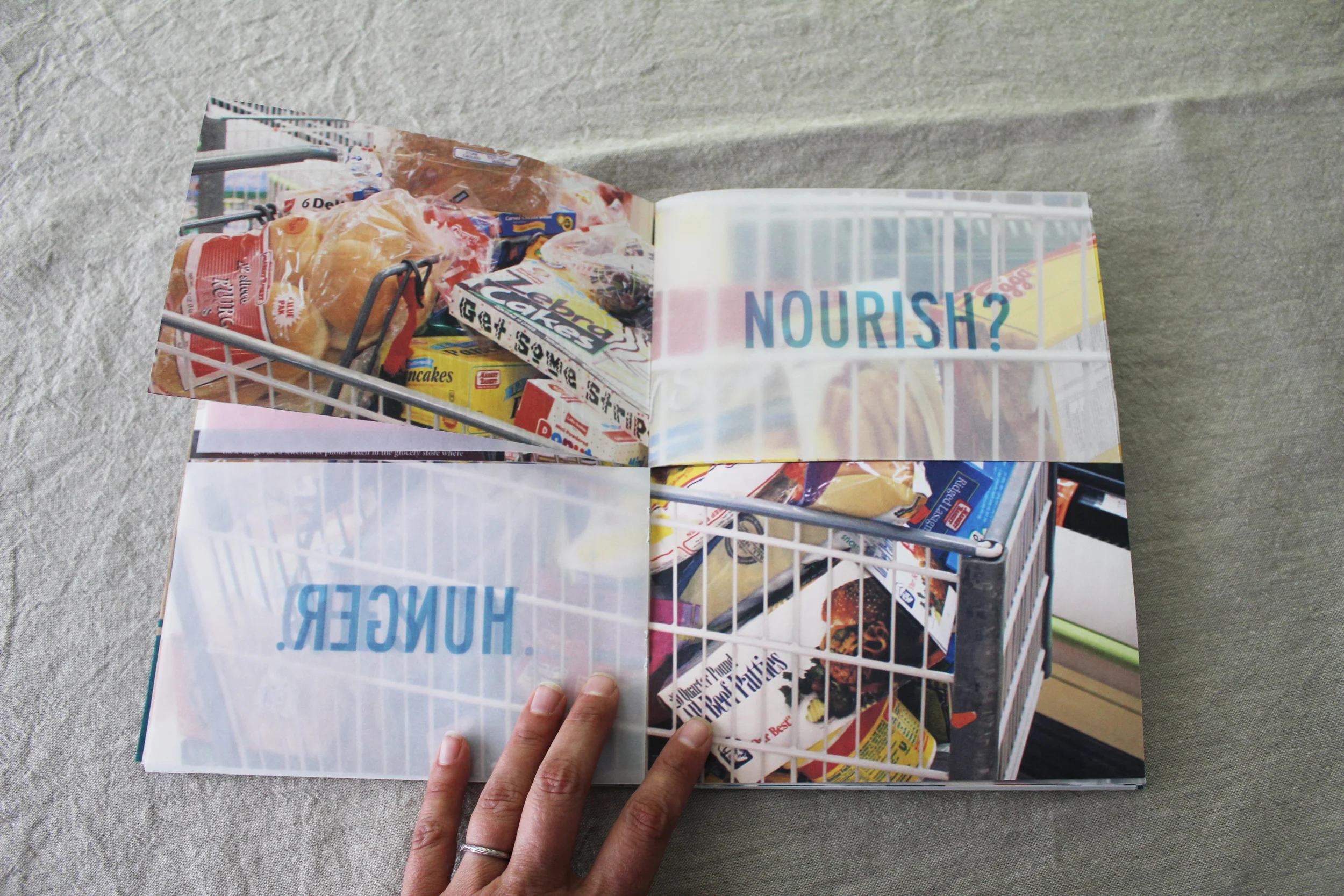
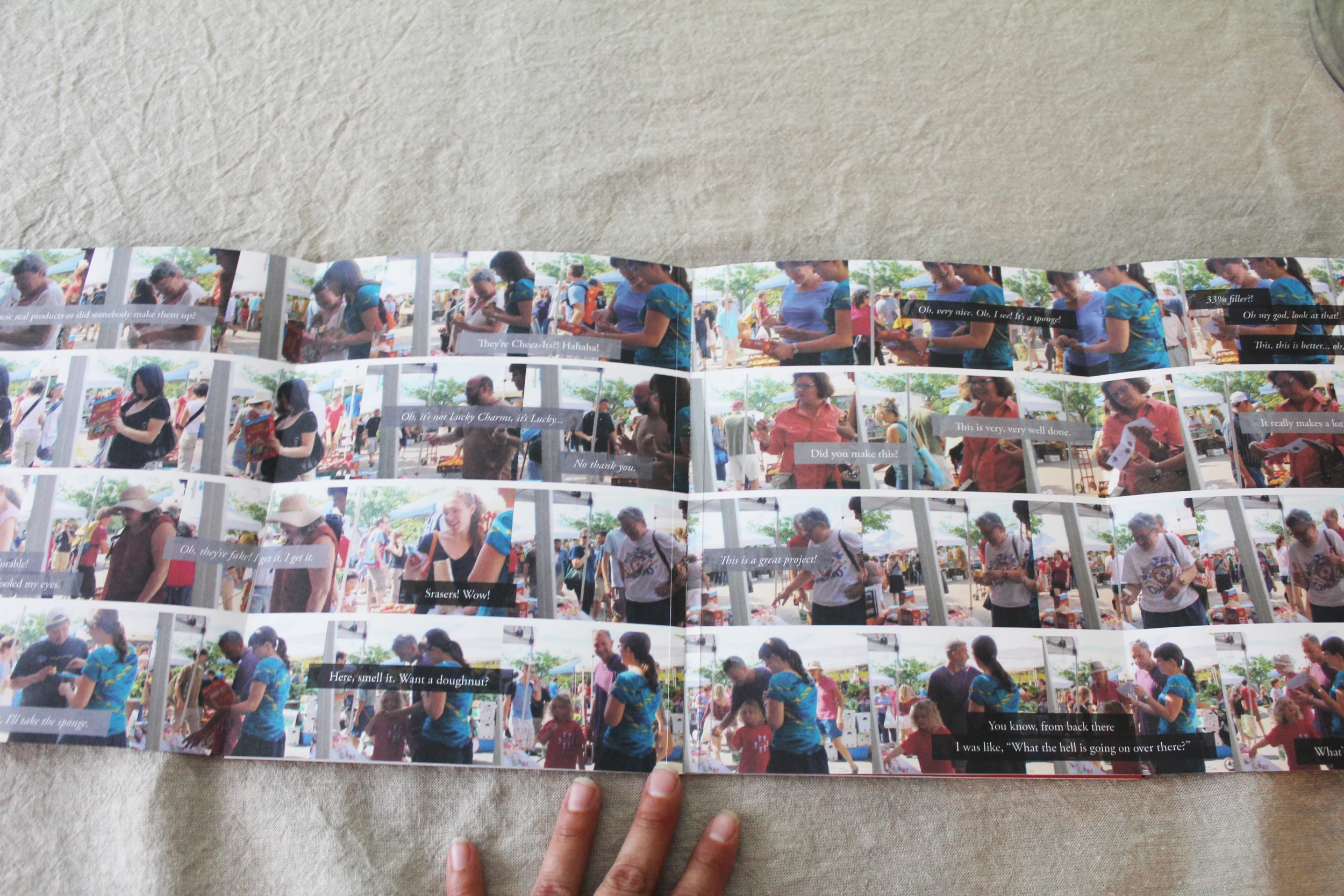
An exploration of interactive, experiential design and its ability to educate people about the conflict between eating foods that fill us and truly being fed. I designed a suite of common packaged "foods" that help teach people about empty calories. The set initially appears to be products we all know and love. Upon closer inspection, you will find the packages have been altered to highlight the non-nutritional value of these items. Inside are the "filler" foods made from inedible materials such as cardboard, feathers, and sponges. The material choices communicate that these have as little nutritional value and provide as much satisfaction as the actual food products they represent.
Documentation booklets for my masters thesis, capturing my research, studio process, final design pieces, and application. My thesis, Fully Fed, explores the concept of being full vs being fed and society's assumptions around health and nutrition.
Gallery installation for the NESAD thesis show at the Art at 12 gallery in Fort Point. Find out more about my thesis work here.
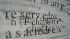
An animated presentation of two pages of the dictionary emphasizing the oscillating relationship between ‘chant’ and ‘chatter’. Intended for projection in two contrasting public spaces: a busy train station and a quiet place of worship.